How to Use Accordions and Toggles for Better User Experience
Why Use Accordions and Toggles for Better User Experience?
Accordions and toggles improve user experience by presenting information in a structured and organized way. Instead of displaying large blocks of text, these elements allow users to access only the content they need, reducing visual clutter and making pages easier to navigate.
Key Benefits of Accordions and Toggles
1. Improve Content Organization
They break down complex information into manageable sections, helping users find relevant details quickly.
2. Enhance Mobile Experience
With limited screen space on mobile devices, accordions and toggles prevent excessive scrolling and create a cleaner interface.
3. Increase User Engagement
Interactive elements encourage users to explore additional content, leading to better engagement and longer session durations.
4. Reduce Cognitive Overload
Displaying too much information at once can overwhelm visitors. Collapsible sections allow users to process information at their own pace.
5. Improve FAQ Pages
Accordions are commonly used on FAQ pages to organize answers efficiently, making it easier for visitors to locate specific information.
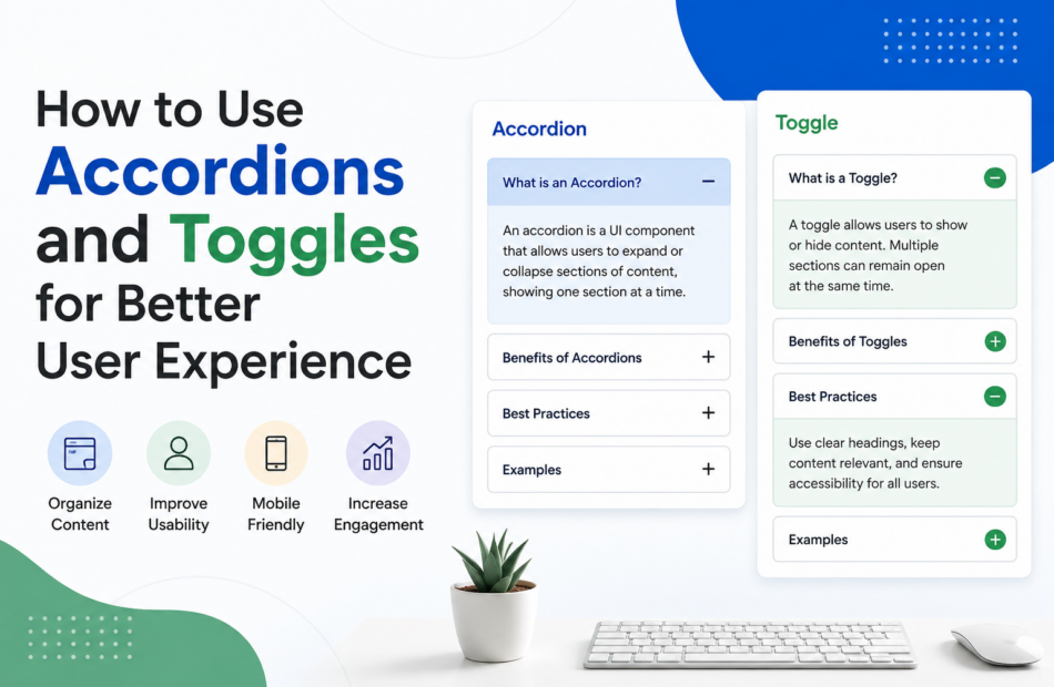
Accordions vs. Toggles
| Feature | Accordions | Toggles |
|---|---|---|
| Open Sections | Usually one at a time | Multiple sections can remain open |
| Best Use Case | FAQs and step-by-step guides | Settings panels and detailed content |
| Space Efficiency | High | Moderate |
| User Control | Limited | Greater flexibility |
Key Takeaways
- Use accordions when content needs to remain concise and organized.
- Use toggles when users may need to compare multiple sections simultaneously.
- Avoid hiding essential information that users need immediately.
- Ensure accessibility by providing clear labels and intuitive navigation.
When implemented thoughtfully, accordions and toggles can significantly improve usability while maintaining a clean and professional website design.
How to Implement Accordions and Toggles Effectively
Using accordions and toggles correctly can significantly improve user experience. However, poor implementation may frustrate visitors and make important information harder to access. Following a strategic approach ensures these elements enhance usability rather than hinder it.
Step-by-Step Guide to Using Accordions and Toggles
1. Identify Content That Can Be Collapsed
Not all content should be hidden. Use accordions and toggles for:
- Frequently Asked Questions (FAQs)
- Product specifications
- Help center articles
- Policy information
- Step-by-step instructions
Avoid placing critical information that users need immediately behind expandable sections.
2. Choose the Right Component
Use accordions when:
- Only one section needs to be open at a time.
- Space-saving is a priority.
- Users typically focus on one topic before moving to the next.
Use toggles when:
- Users may need to view multiple sections simultaneously.
- Content comparison is important.
- Greater flexibility is required.
3. Write Clear and Descriptive Headings
The labels used for accordion and toggle sections should clearly communicate what users will find inside. Avoid vague titles such as “More Information.”
Good examples:
- Shipping and Delivery Information
- Account Security Settings
- Frequently Asked Questions
4. Prioritize Accessibility
Ensure that all users, including those using assistive technologies, can interact with the content effectively.
Best practices include:
- Using keyboard-friendly navigation
- Providing clear focus indicators
- Maintaining sufficient contrast ratios
- Ensuring screen reader compatibility
5. Test on Different Devices
A design that works well on desktops may not perform equally well on mobile devices. Review the user experience across various screen sizes to confirm that interactions remain intuitive.
Common Mistakes to Avoid
- Hiding essential information users need immediately.
- Overusing accordions throughout the entire page.
- Using unclear or misleading section labels.
- Ignoring accessibility requirements.
- Failing to test functionality on mobile devices.
Practical Example
An e-commerce website can use accordions to organize product details such as specifications, return policies, and customer support information. This approach reduces clutter while still giving users easy access to the content they need before making a purchase decision.
Best Practices at a Glance
- Keep section titles concise and descriptive.
- Limit the number of expandable sections.
- Make interactions predictable and consistent.
- Test for usability and accessibility.
- Prioritize the user’s needs over design trends.
When used strategically, accordions and toggles create a more streamlined and engaging experience, helping users navigate information efficiently without feeling overwhelmed.
Frequently Asked Questions (FAQs)
1. What are accordions and toggles in web design?
Accordions and toggles are interactive UI elements that allow users to expand or collapse content sections, improving content organization and usability.
2. What is the difference between accordions and toggles?
Accordions typically allow only one section to remain open at a time, while toggles enable multiple sections to stay expanded simultaneously.
3. Do accordions improve user experience?
Yes. When used correctly, accordions reduce visual clutter, improve navigation, and help users find relevant information more efficiently.
4. Are accordions and toggles mobile-friendly?
Absolutely. These elements are especially useful on mobile devices because they save screen space and minimize excessive scrolling.
5. Are accordions good for SEO?
Yes. Search engines can index content within accordions as long as the content is accessible in the page’s HTML and provides value to users.
6. Where should accordions be used?
Accordions work well for FAQs, product details, support documentation, policy pages, and step-by-step guides.
7. Can too many accordions hurt usability?
Yes. Overusing accordions may hide important information and frustrate users. They should be used strategically.
8. What are the accessibility considerations for accordions?
Accessible accordions should support keyboard navigation, screen readers, clear labels, and proper focus indicators.
9. When should I use toggles instead of accordions?
Use toggles when users may need to view multiple content sections simultaneously for comparison or reference.
10. What are the best practices for using accordions and toggles?
Keep headings descriptive, avoid hiding critical information, prioritize accessibility, and test functionality across devices.
Conclusion
Accordions and toggles are powerful design elements that can significantly enhance user experience when implemented thoughtfully. By organizing content into manageable sections, they improve readability, reduce cognitive overload, and help users navigate information more efficiently across both desktop and mobile devices.
The key to success lies in using these components strategically. Focus on clarity, accessibility, and user intent rather than simply following design trends. When applied correctly, accordions and toggles can contribute to higher engagement, improved usability, and a more intuitive browsing experience.
As digital experiences continue to evolve, understanding the principles of effective interface design remains essential for website owners, designers, and developers alike. For more insights on cryptocurrency investing, market trends, Bitcoin cycle analysis, and educational resources designed for long-term investors, explore TheCryptoInvestors.com, a platform dedicated to helping investors make informed decisions through data-driven intelligence and market awareness.
Content Goal
The goal of this article is to educate readers on how accordions and toggles can be used effectively to improve user experience. By providing practical guidance, implementation strategies, and best practices, this content aims to help businesses, designers, and website owners create more user-friendly digital experiences. Additionally, the article is optimized for Google AI Overviews and featured snippets while maintaining a strong focus on readability, usability, and real-world value.